top of page
Vectiva: One Score for Your Whole Diet
Most nutrition apps overwhelm you: calories here, vitamins there, minerals somewhere else. You're left asking: "But am I actually doing well?"
Vectiva answers that with a single score.
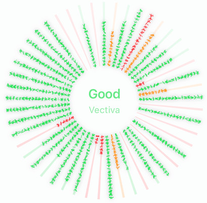
It works by comparing what your body needed against what you actually ate; across 60+ nutrients, then compressing that into one number between 0 and 1, and a label: Low, Mid, Good, or Excellent.
The radial chart makes it visual. When your wheel glows evenly, your diet is balanced. When tiles are missing, you see exactly where to focus.
Unlike generic nutrition scores, Vectiva is personalized to your profile and time-aware, so you can track a day, week, or month, and see habits rather than noise.
One score. One chart. A clear picture of where you stand.

+37 more
bottom of page